*This project is under the NDA, so design is altered.
Swiss Learning Hub Admin
Promikos doo, Belgrade

Client
Swiss Learning Hub
Role
Single Senior Product Designer
Tools
The Swiss Learning Hub Administration interface was limited, and features were overwhelming the product, making it challenging for administrators to manage and deliver learning content effectively. In two years, the platform has undergone a series of updates, creating a extensive design system, new page patterns and improving features, resulting in a significant improvement in its capabilities.
Challenge
The platform lacked consistency in design and page patterns, resulting in a confusing user experience. To improve, a user-centered design approach is needed, along with a well-defined design system to establish a consistent visual language for users.
Solution
First step was creating a design system that provided consistency in layout and design. Next was establishing consistent page patterns, to create a more user-friendly and efficient experience for our users.
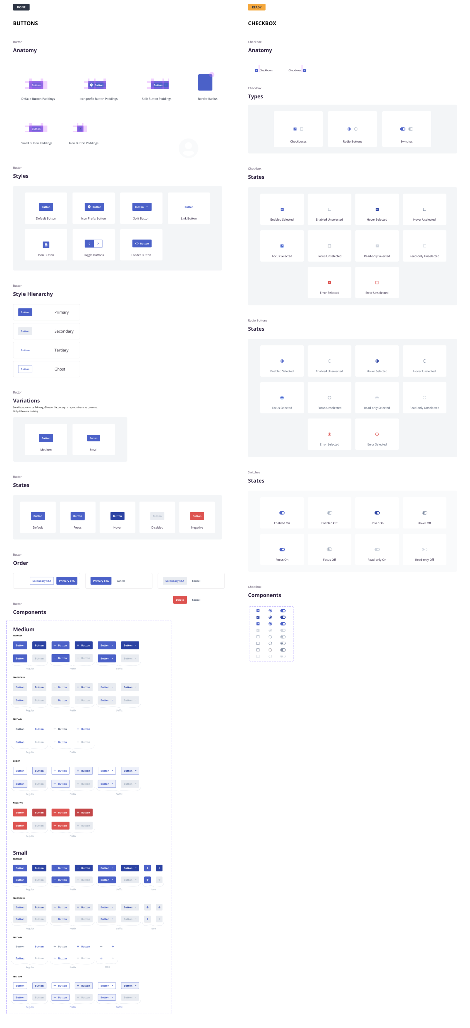
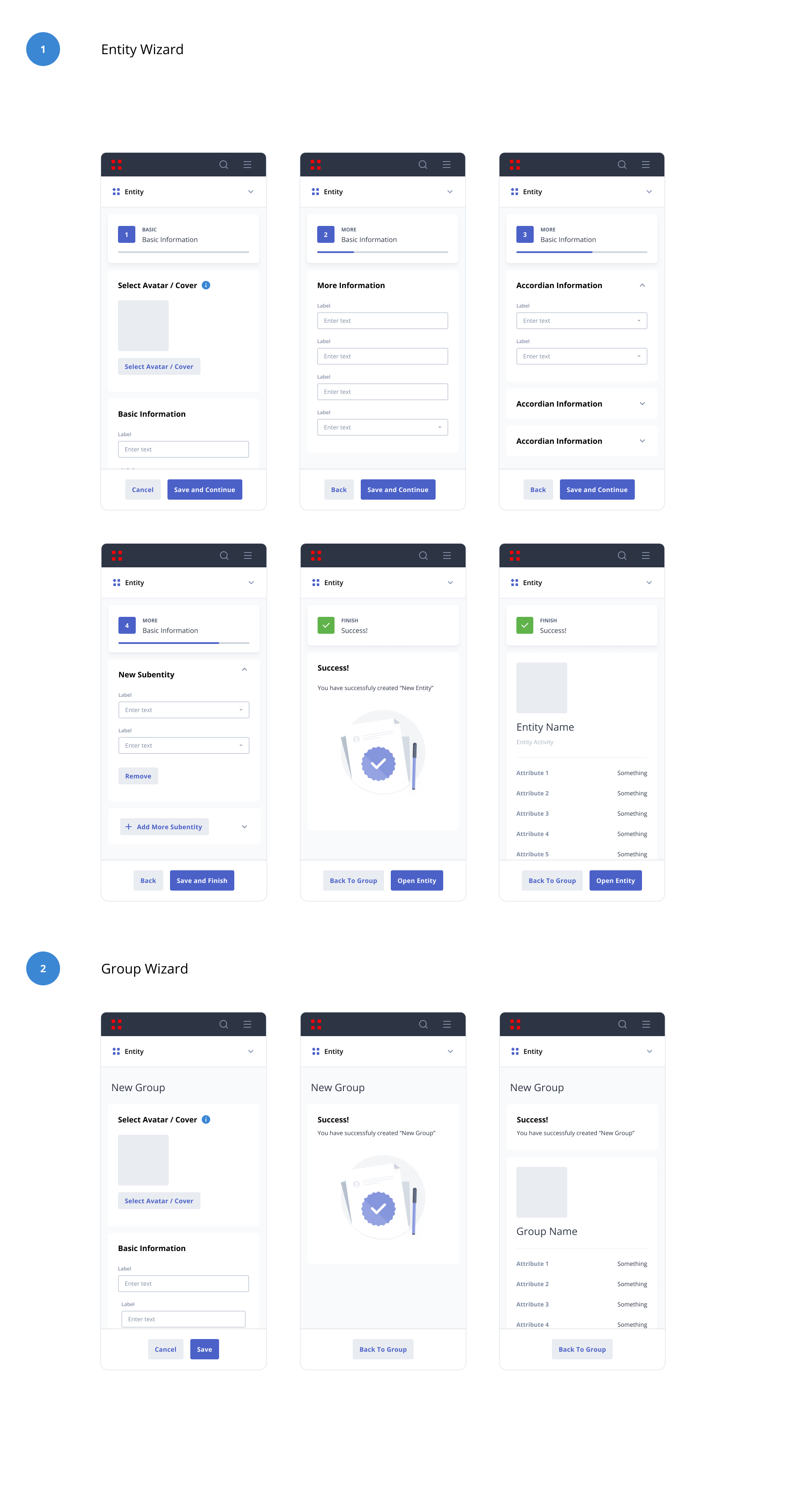
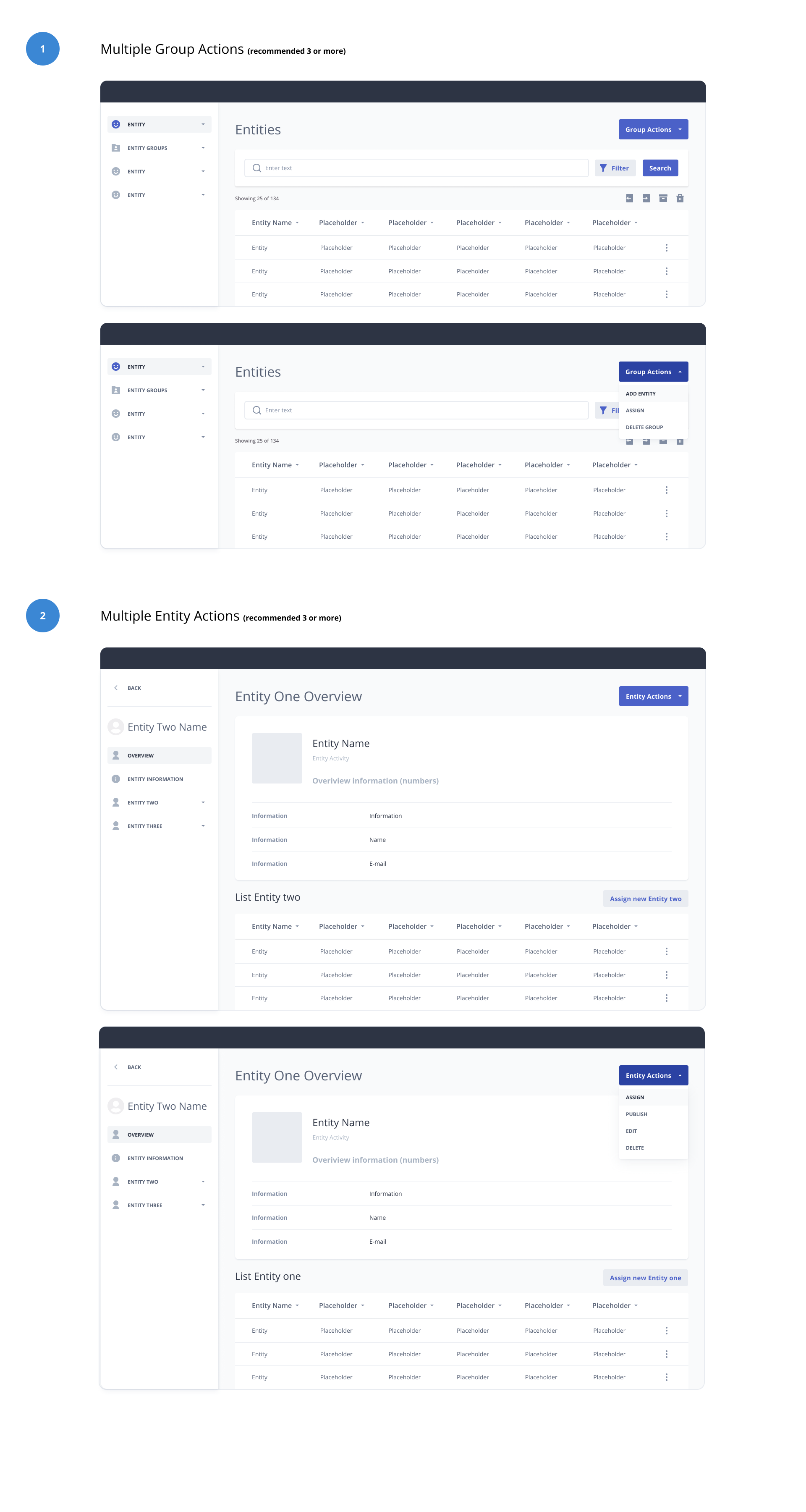
Designing with components
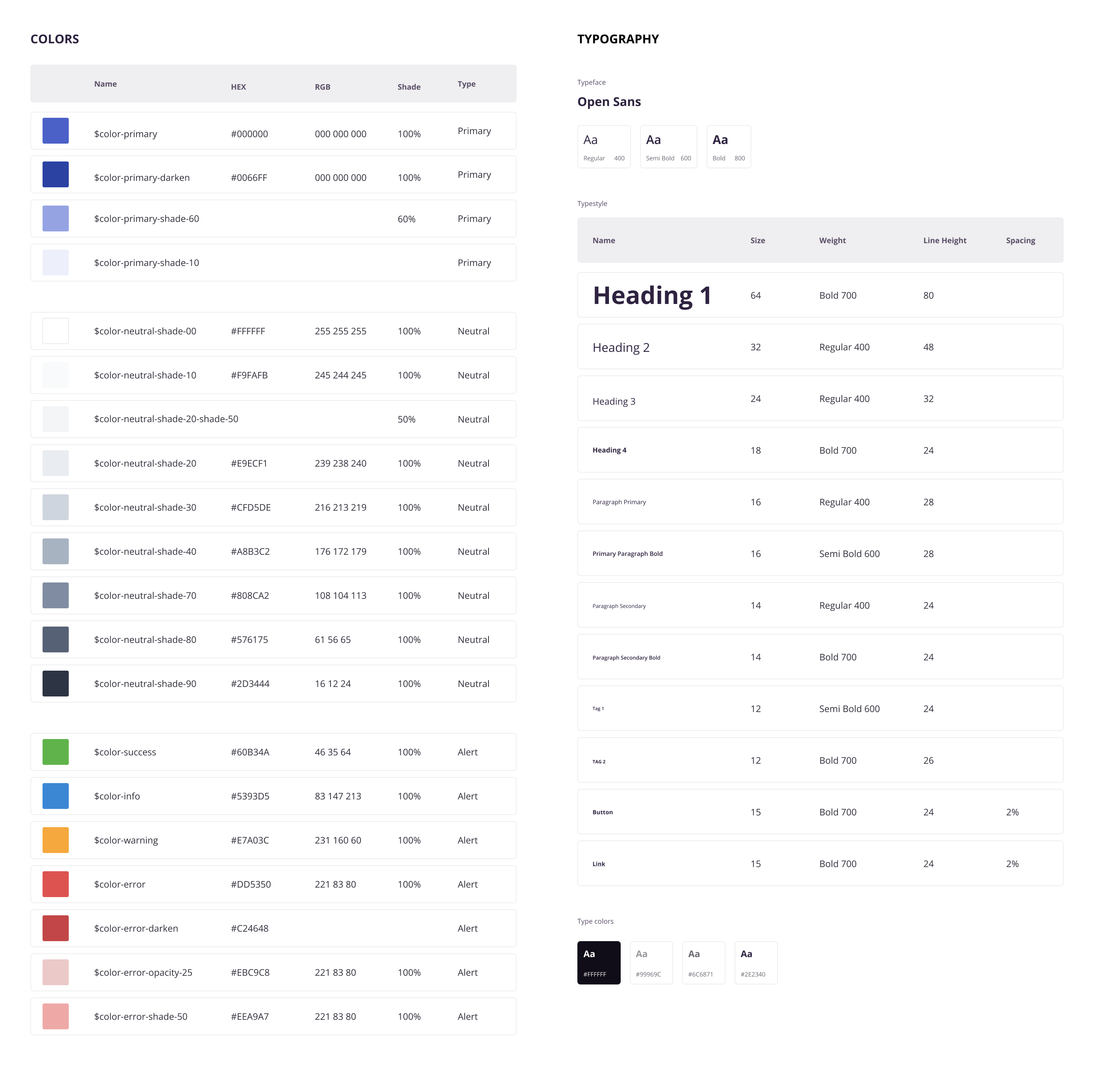
To maintain consistency in design and ensure compliance with AA standard accessibility guidelines, a design system was created in Figma. This system includes reusable components such as buttons and forms, saving time in the design process and ensuring consistency across different screens and devices.
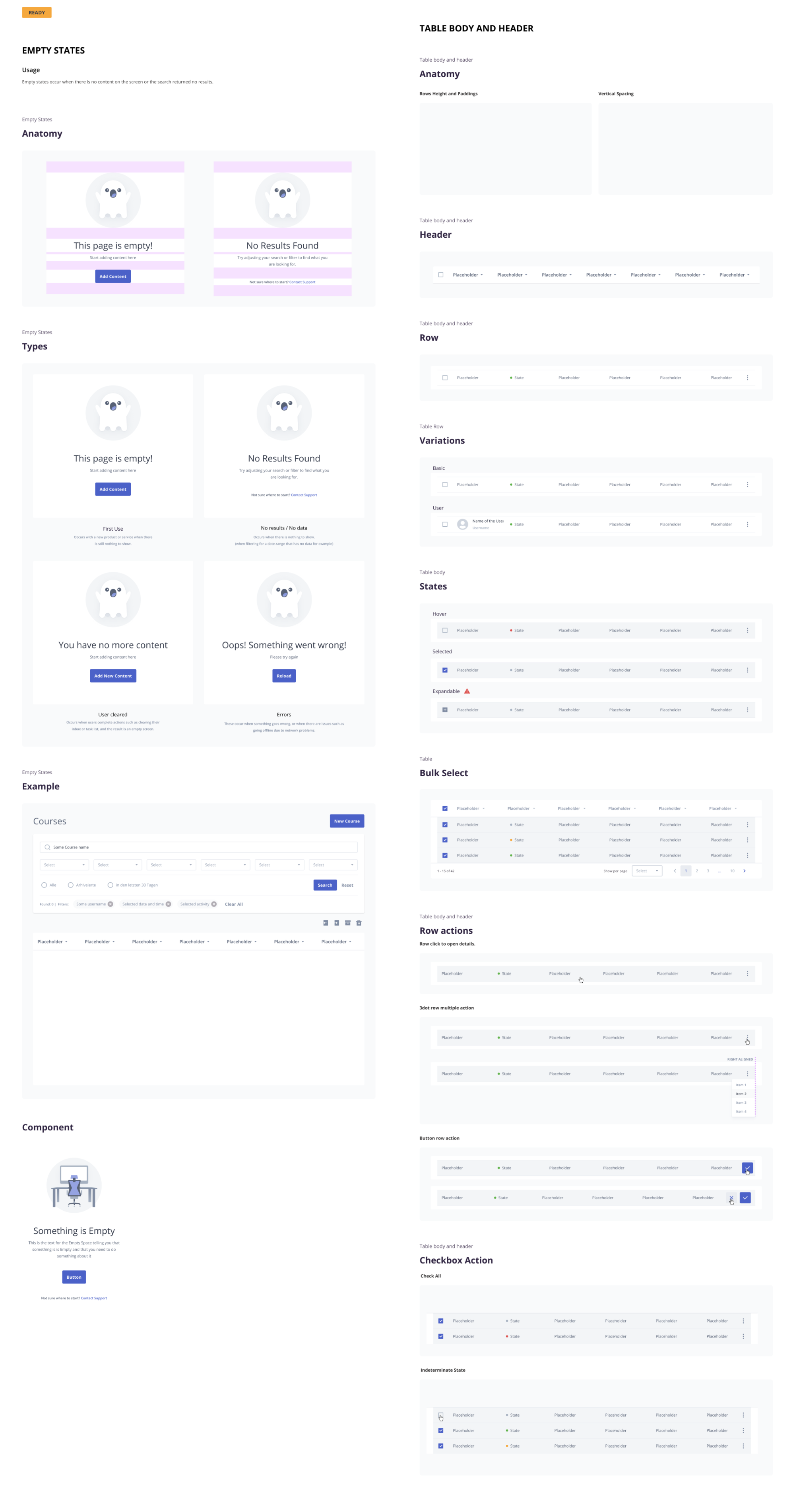
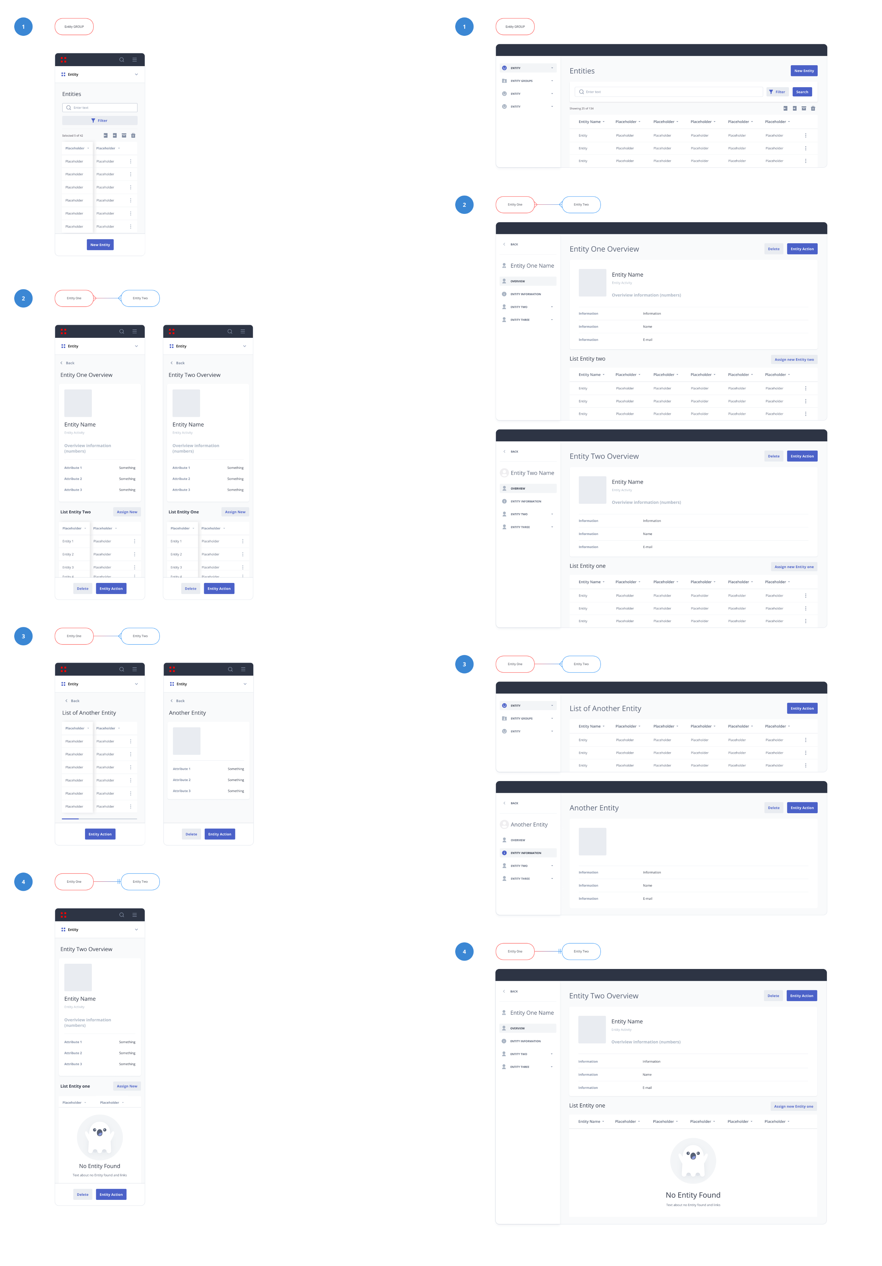
Page Patterns
Page patterns in SLH Admin showcase visually highlights how these patterns are used throughout the platform, making it more user-friendly and efficient.
Balancing Aesthetics and Functionality: During the Learning HUB reskin phase, a challenge arose concerning inconsistencies in page designs. In response, I conducted a thorough analysis of each page, identifying and elements that deviated from the desired patterns. I addressed the discrepancies by creating standardized page patterns. This approach established a foundation for a more cohesive and professional user experience.
Iconography
By using visually appealing Empty State icons, the interface can provide a more positive and engaging user experience, even in cases where there is no content to display.
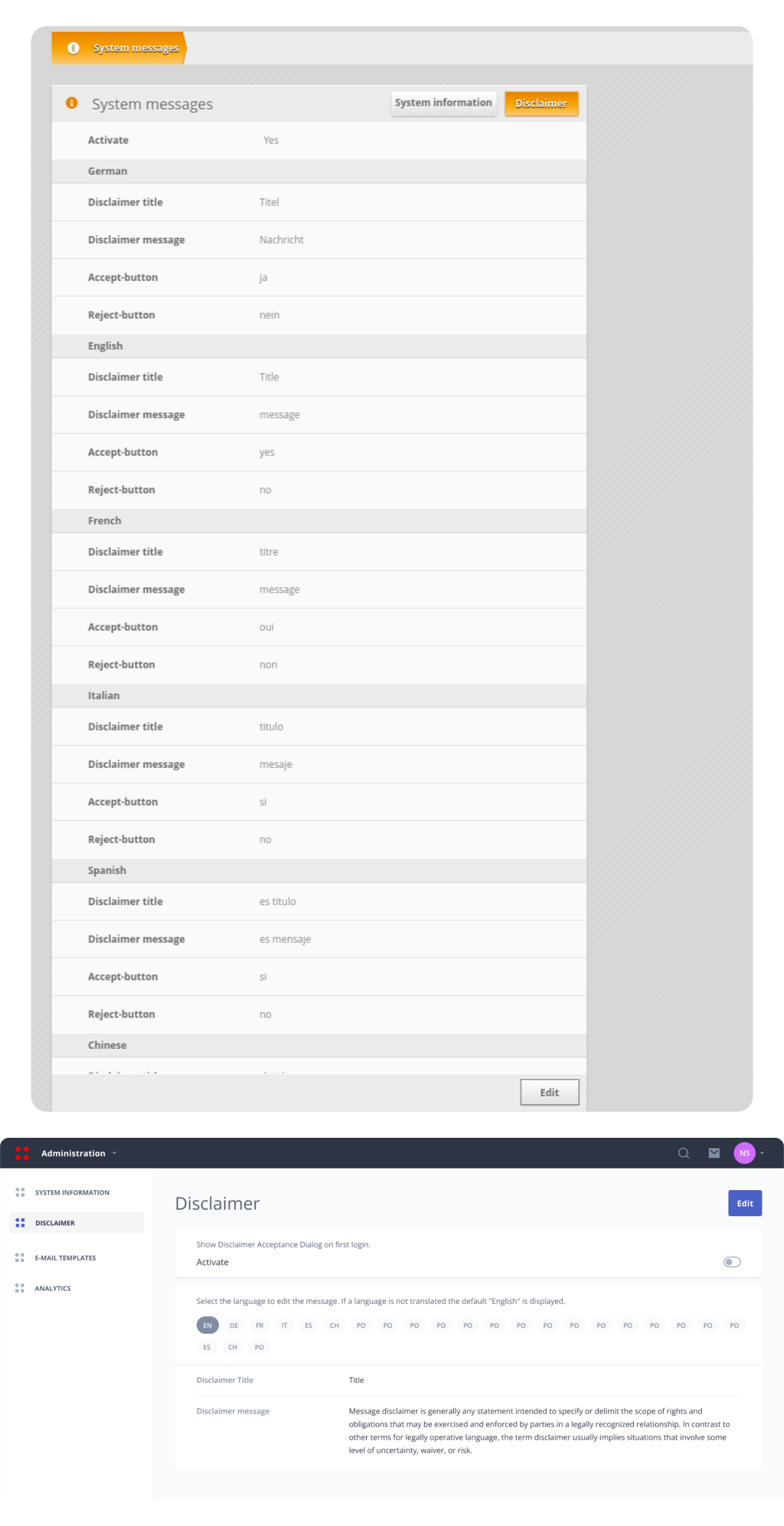
Legacy vs Redesign
Shown below is a side by side comparison of the old and redesigned version of the Disclaimer page.
Improvement is created by easy access to all the languages without scrolling, by using chips. But the most important improvement is page layout, by establishing the navigation area, action area and content area.