*This project is under the NDA, so design is altered.
Swiss Learning Hub Learner App
Promikos doo, Belgrade
Client
Swiss Learning Hub
Role
Single Senior Product Designer
Tools
The learner part of the Swiss Learning Hub app is designed to provide users with an intuitive and engaging learning experience. The platform offers a range of features to support learning, including personalsed recommendations based on user preferences, progress tracking, and the ability for easy enrollment.
The company lacks established research procedures, and information is obtained from Google Analytics without any set events triggering metric collection. Therefore, I can only rely on their opinion and my experience to make decisions.
Challenge
SLH has a strong opinionated stakeholders that were developing this web application for 12 years. App is complex, new features were drawn from the funnel. Also, there are 50+ tenants who want to have their own branding displayed.
Solution
Improvements needed to be incremental. Starting from the revisiting legacy map and improving it, to redesign of the MVP, and creating the design system.
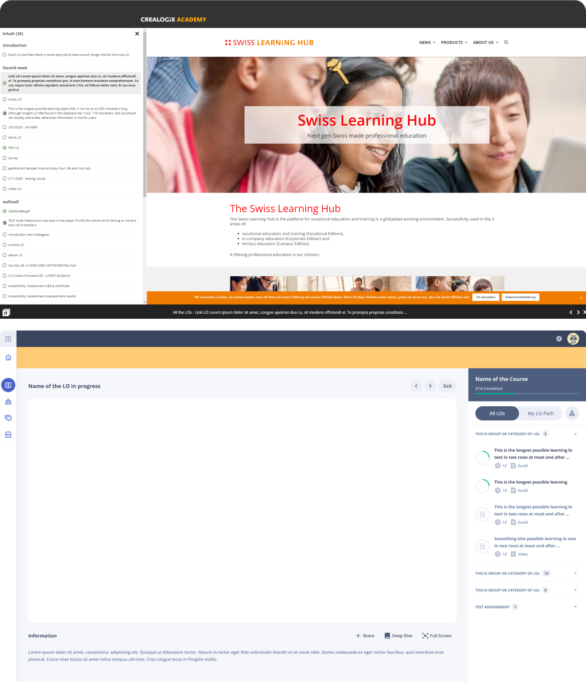
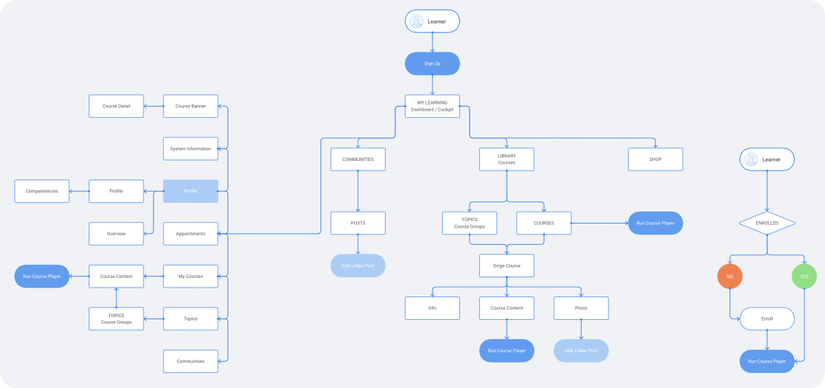
Mapping the Application
Upon analysis of the existing application, it became clear that restructuring was necessary. The Course Player was identified as the MVP, and a new approach was implemented by creating a dedicated Course Content page. This restructuring included the addition of two new options, which improved the overall informational architecture and provided users with easier access to the Course Player.
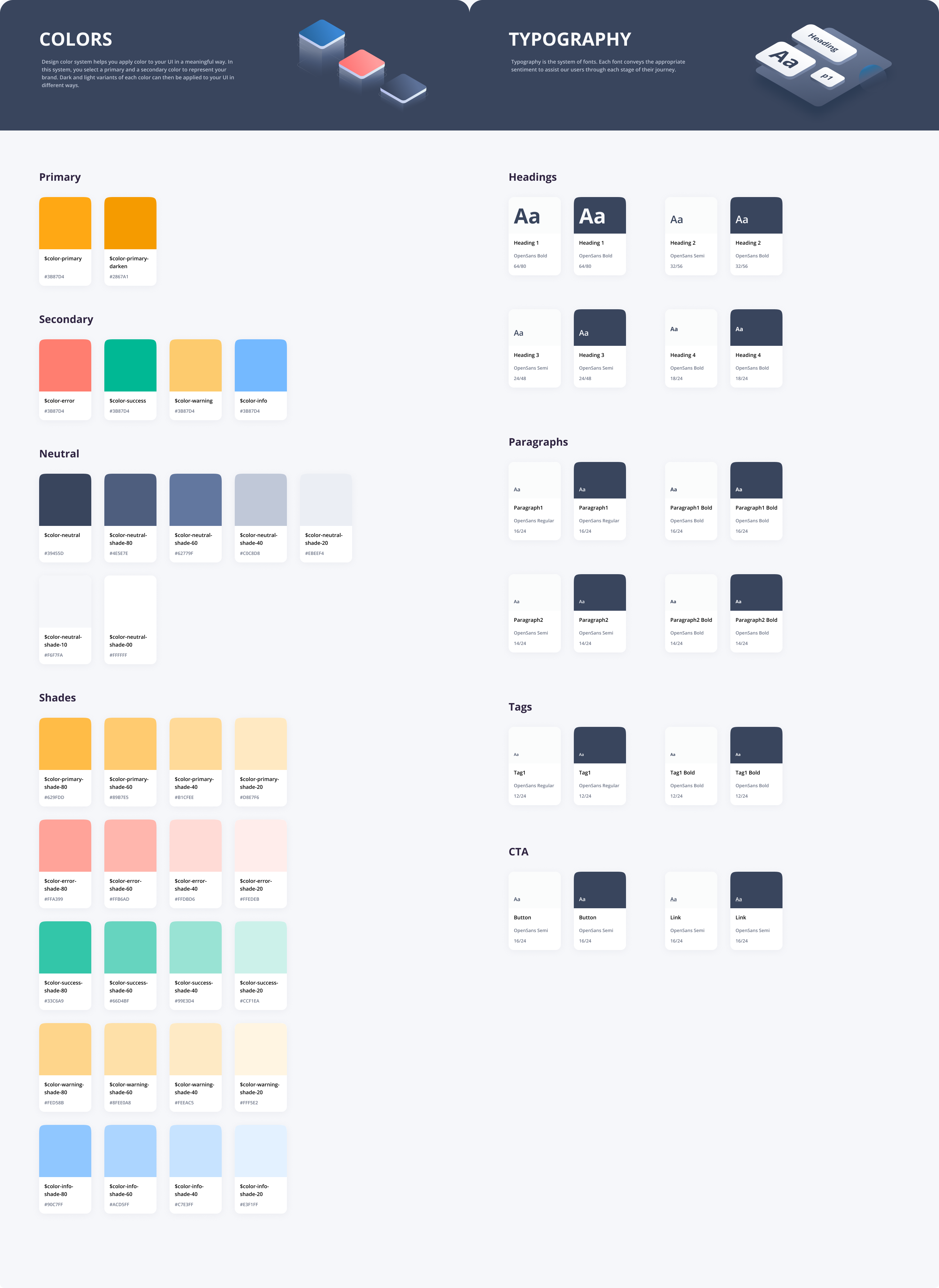
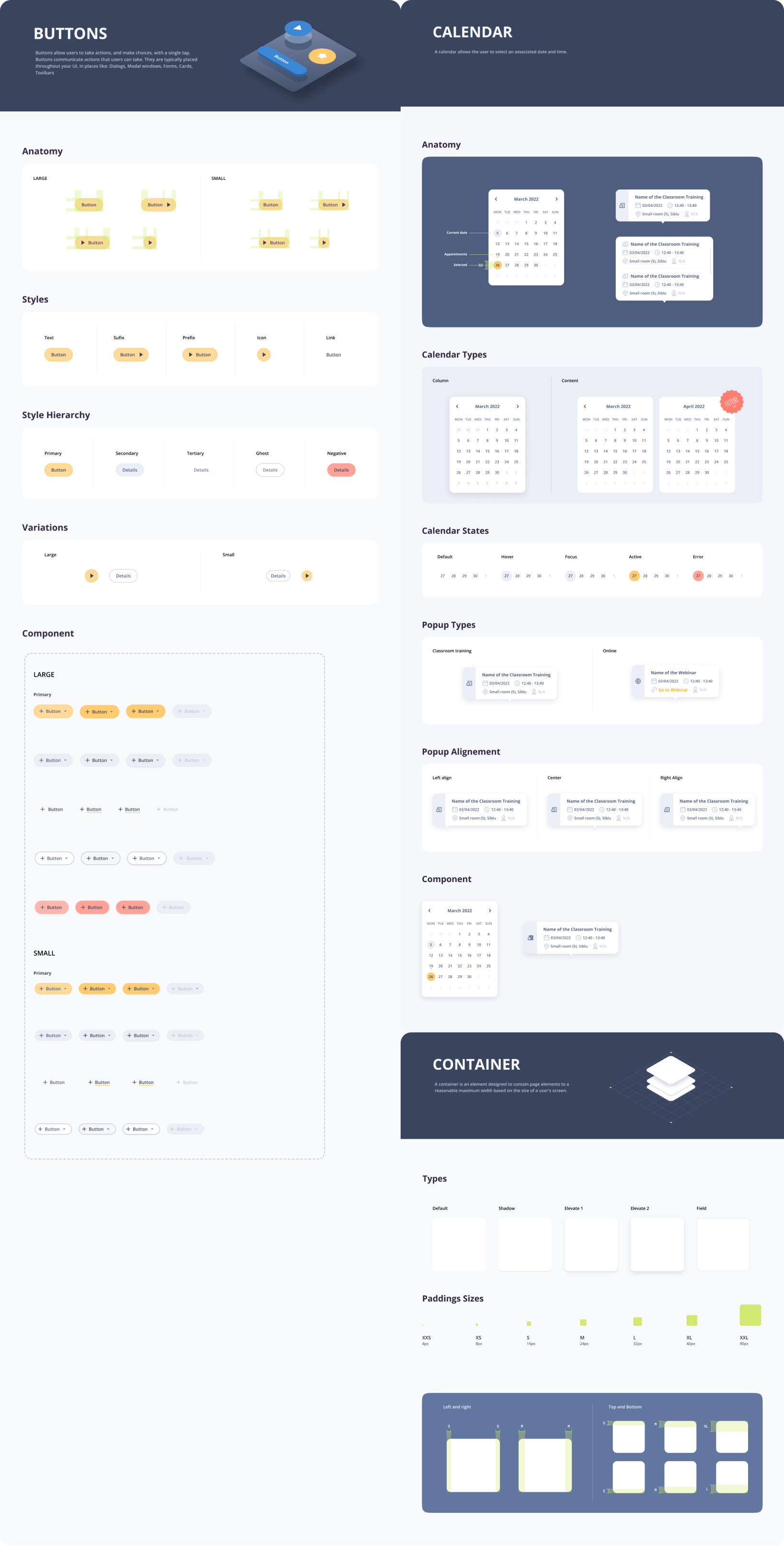
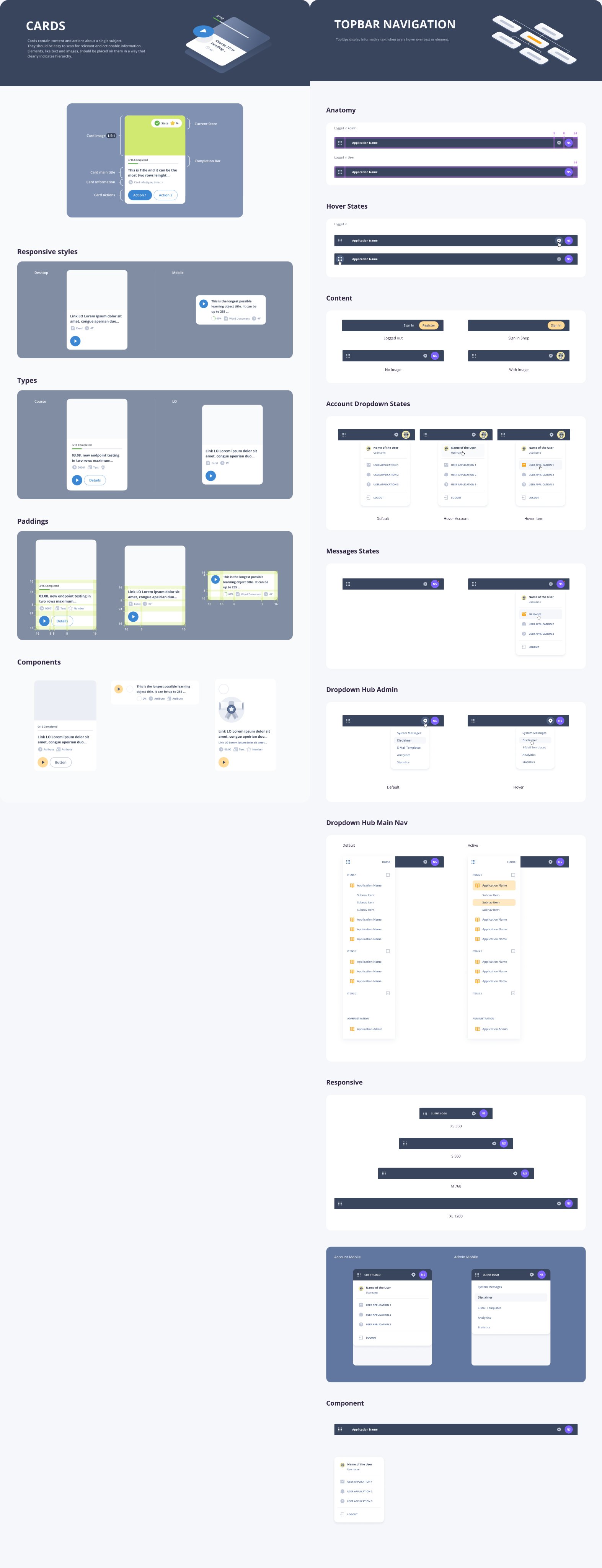
Designing with components
To ensure consistency in design and facilitate efficient implementation of changes, I established a design system in Figma as my first step. This system meets the accessibility requirements outlined in AA standards, providing inclusive user experience.
Adapting to Emerging Technologies: The most recent challenge emerged with Figma, marked by a significant update introducing variables. While this innovation proved transformative for designers, it presented a substantial task of effectively translating tokens and components without disrupting the design system. To navigate this, I adopted an incremental approach, beginning with tokens. I started by incorporating basic colors and then assigned them to various states and styles. Subsequently, I extended this process to styles such as spacing and radius, methodically implementing them into the components.
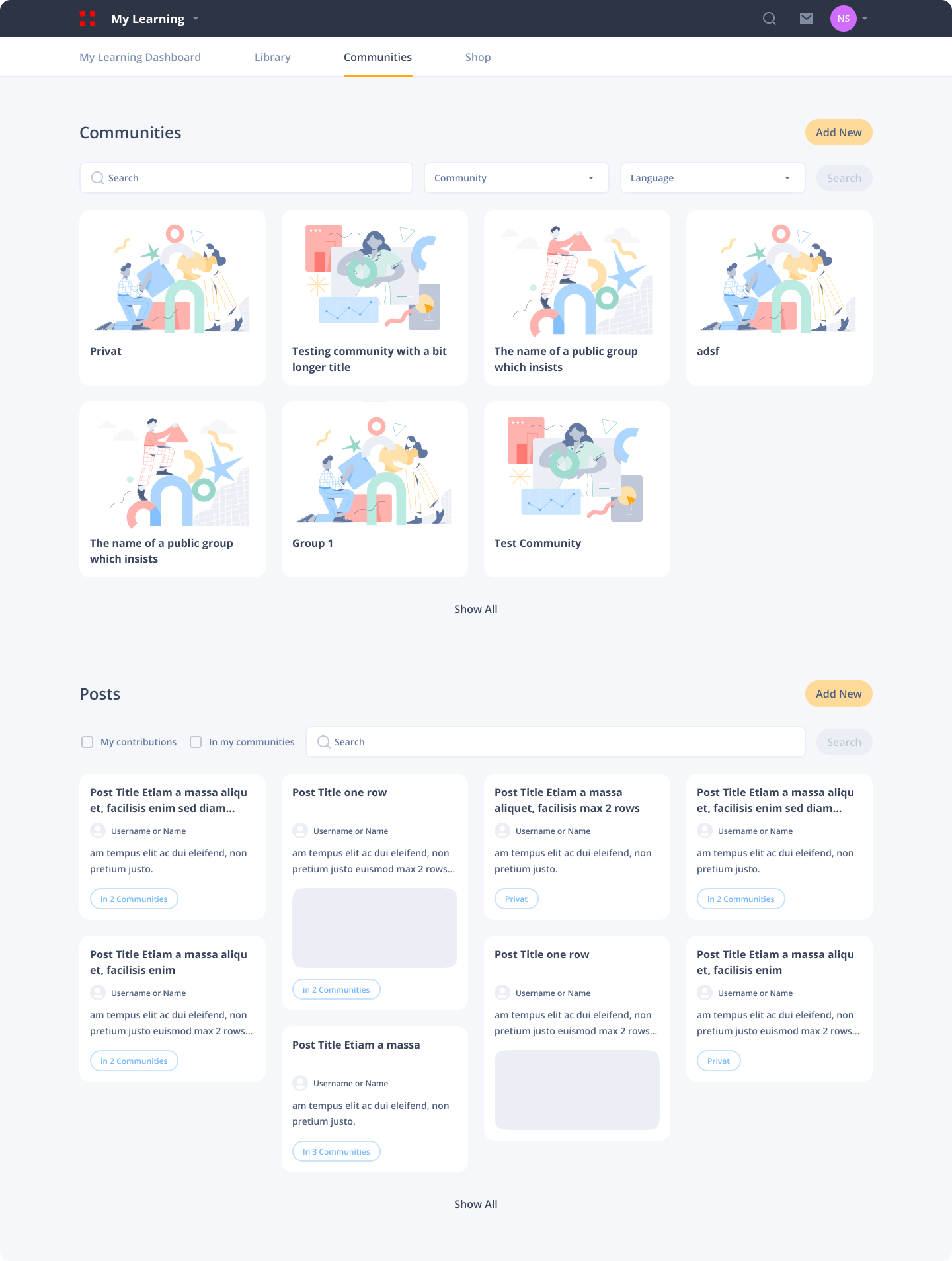
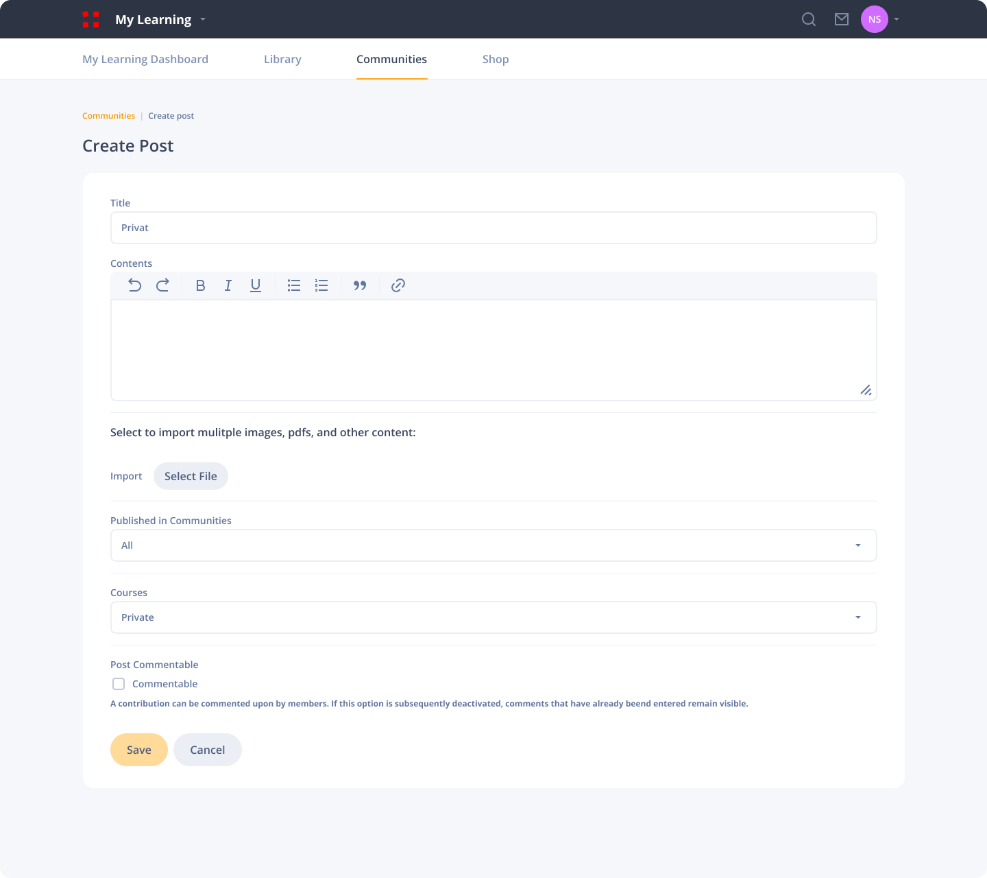
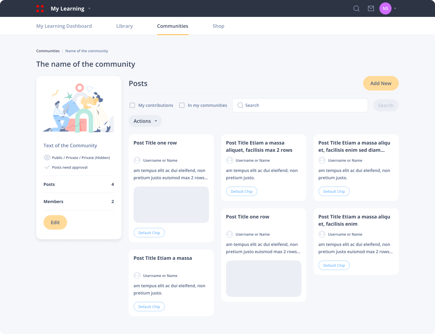
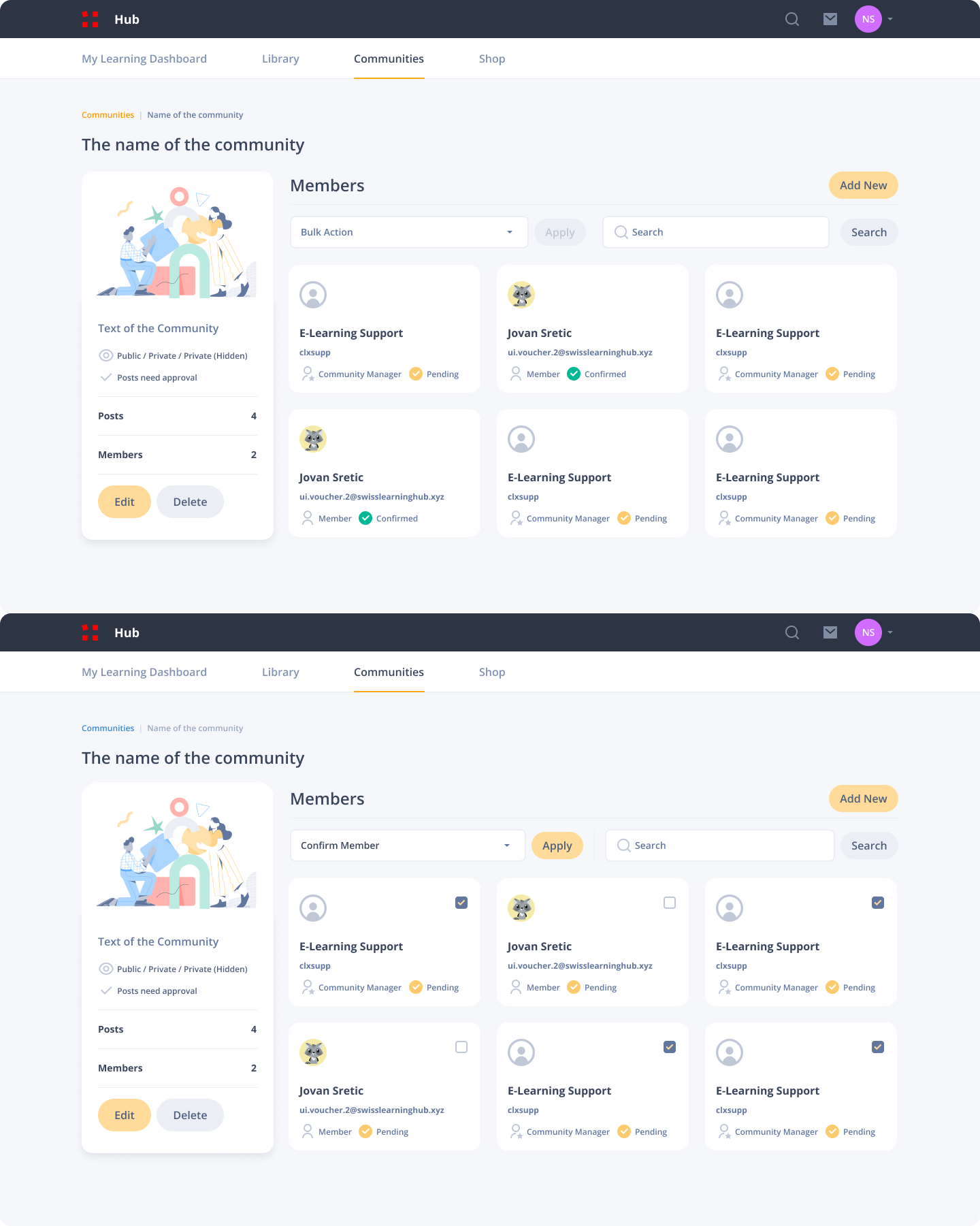
Community redesign
Showcasing one of the features of the SLH learning platform.
User Feedback Incorporation: During the Reskin phase of the project, I received a feedback from the Stakeholder expressing their preference against illustrations. Although the application primarily uses illustrations in specific instances such as Empty States and Success states, it posed a challenge to devise engaging pages for these scenarios. To address this, compromises were implemented. Special Empty States were crafted, integrating user information seamlessly. In instances where illustrations were unavoidable, efforts were made to ensure they didn’t draw excessive attention, instead providing subtle visual cues to convey information. These adjustments proved successful in satisfying the Stakeholders.
Legacy vs Redesign and Impact
Shown below is a side by side comparison of the old and redesigned version of the Course Player.
The new Course player design offers the flexibility to go full-screen or original size and moves the navigation to the right, showing relevant course information and LO completion percentage. Also provides the user different paths of learning.
Our platform acquires users through tenants, and their lifetime on the platform is tied to the duration of a course. Also, there is no need to acquire customers or convert free accounts to paid users. As a stakeholder-driven company, the impact of the redesign is unknown, and metrics are not within my purview.