3g Store
Freelance project redesigning e-commerce site

Client
3G Store
Role
Single UX/UI Designer
Tools
Client wanted to update the design and improve usability and create consistency of existing web shop. Specifically, the redesign was aiming to address pain points that users have experienced with the current site, such as difficulties in finding products, confusing navigation, or a slow checkout process.
Challenge
Client’s old web shop is cluttered with products, categories and search is limited. Products have too much description, adding to cart is challenging. Shop is not mobile friendly and 84% of users use mobile phones.
Solution
Ideating and wireframing using available quantitative research and mobile first approach. Creating filtering and easy accessible categories. Improving description, cart and overall user experience.
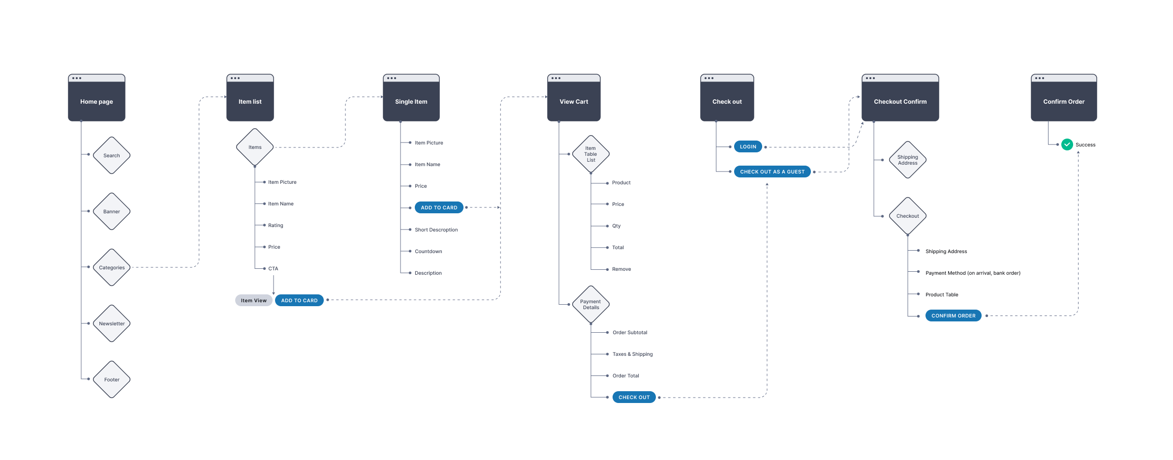
Mapping the Web Shop
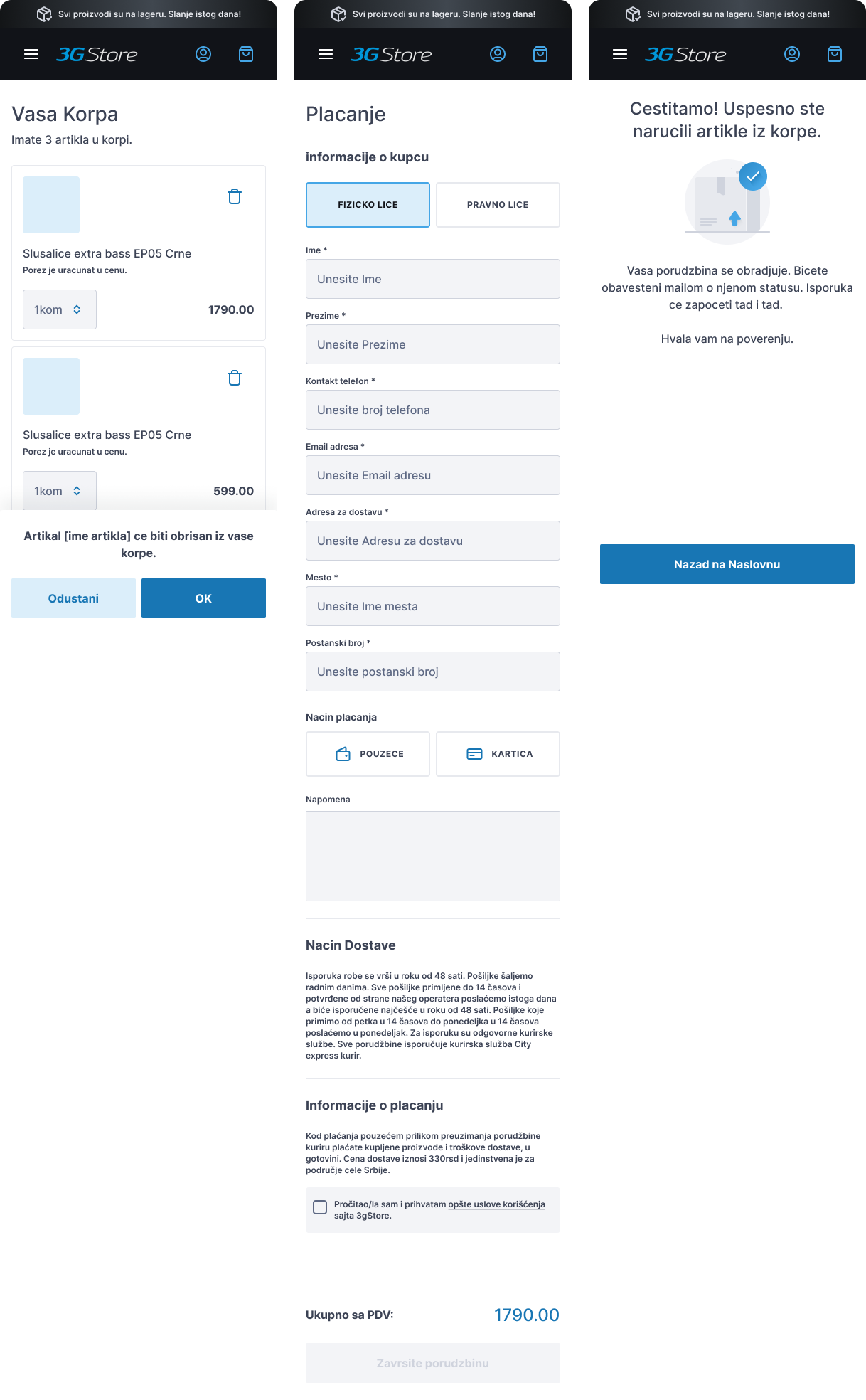
For an e-commerce site that sells mobile phone equipment and parts, the site mapping process would involve identifying key product categories and subcategories, then group these pages into logical categories and arrange them in a hierarchical structure that reflects the user’s mental model and makes it easy for them to find what they’re looking for. The other aspect is getting a user to complete the purchase. To address this pain point, it was important to address the main reason: complicated or confusing checkout process and lost of interest.
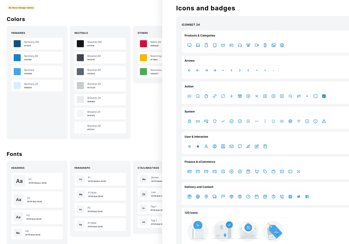
Designing with components
Design system was a valuable tool for this small e-commerce project as it helps ensure consistency, reduces development time, and creates a user-friendly experience. By utilising a design system, 3G Store can establish a strong brand identity and deliver a seamless user experience to customers.
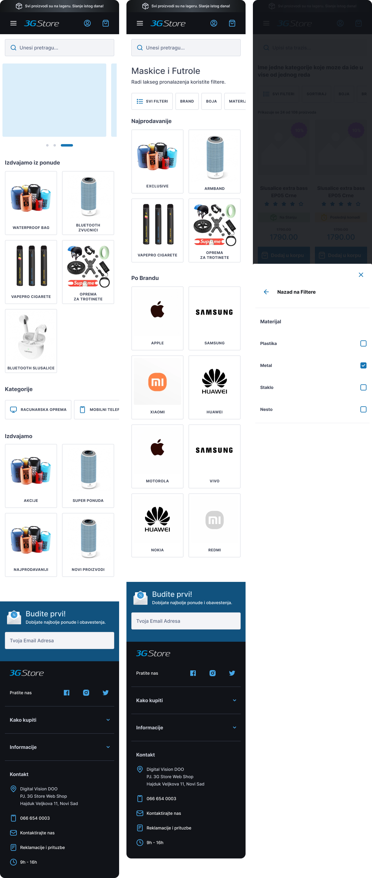
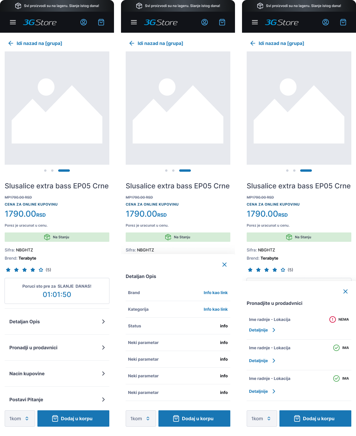
Wireframing
This is a part of wireframing for 3G Store showing the quick user journey to the checkout. When wireframing an e-commerce site, it’s important to consider the various elements that will be present on each page, such as product listings, filters, search bars, shopping carts, and checkout forms.
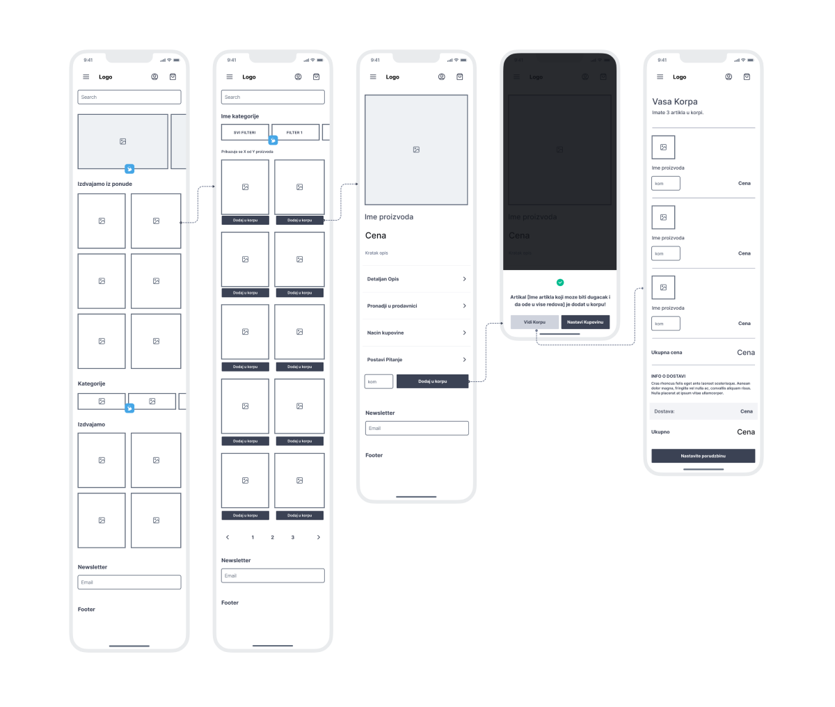
Mobile first approach
Target group is 84% of mobile users, so I optimised all UI designs strongly for mobile. I also incorporated mobile-specific features and functionality, such as swiping and scrolling gestures. By designing with mobile users in mind first, I ensured that the site is optimised for the majority of users and can then expand and adapt the design for larger screens and desktop devices.
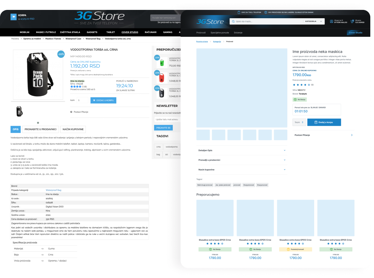
Legacy vs Redesign and Impact
Shown below is a side by side comparison of the old and redesigned version of the Single Product page.
Some of the key changes include improved information architecture as well as minimalistic design with consistent visuals.
This project is under development, so the UX and business metrics are still unavailable.