*This project is under the NDA, so design is altered.
College Confidential
Kontrast doo, Belgrade

Client
College Confidential
Role
Team Lead on College Confidential
Tools
Collegeconfidential.com is an online platform for discussions on college admissions, scholarships, and academic programs. It features forums for specific colleges, majors, and standardized tests, along with articles and resources on college-related topics.
Challenge
New students need to learn about basic college categories, find in-depth information on academics, tuitions, financial aid, campus life, and their carrier path.
Too much influence on new students, opinions from inside and out, like parents, alumni, friends and surroundings, makes students unsure of their choices. The need to collect all the information in one spot.
Solution
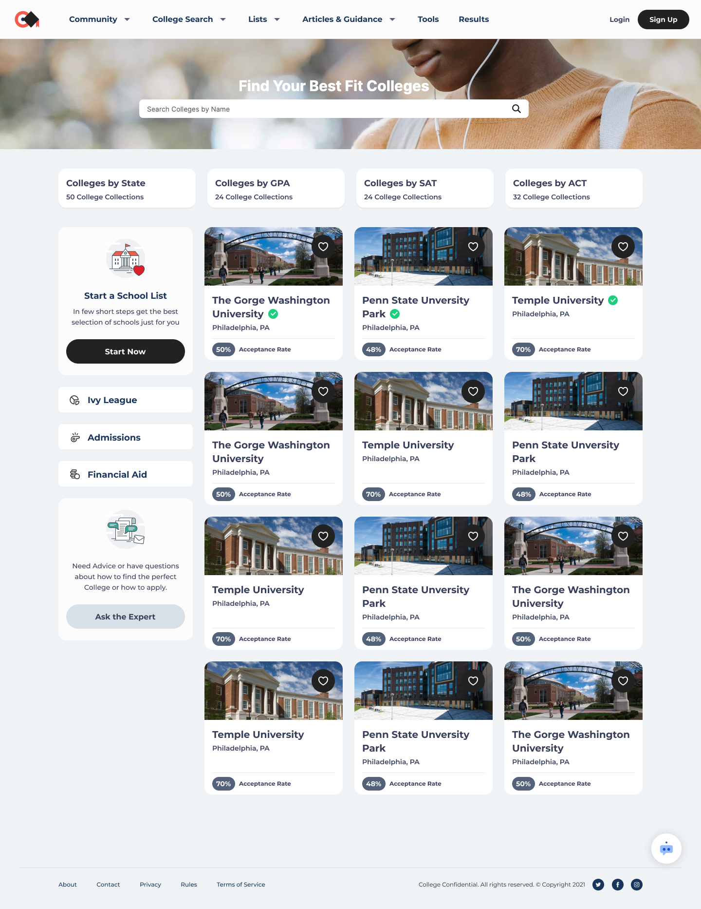
Create option to find colleges that matches users preferences. Search for colleges by location, majors, size and more.
Create environment for Coaches.
Option to check out individual profiles of the colleges that come up in your College Search results.
User to have “Save School” option and create Favourites list.
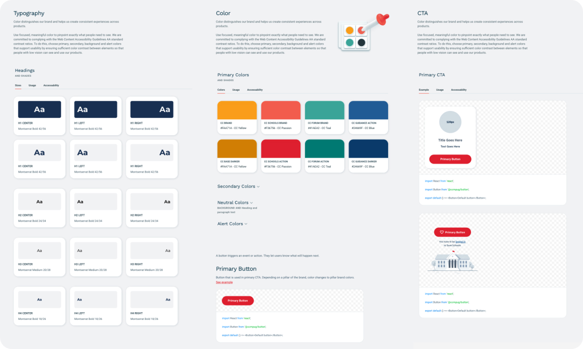
Designing with components
To ensure consistency in design and facilitate the application of changes throughout the process, the first step was to establish a design system in Figma. Tools we used for that were Sketch and InVision with the plan to create Storybook library.
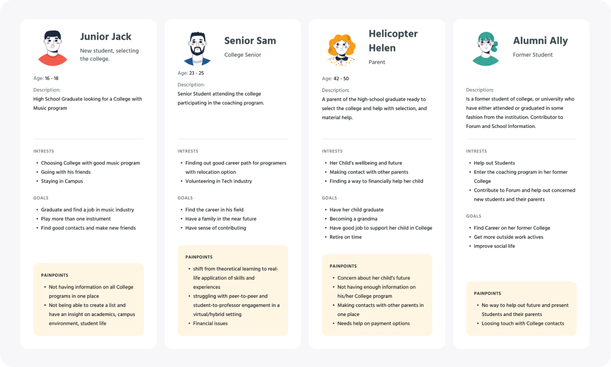
Personas
We identified several key personas that represent our target audience. For example, personas for high school students, parents of high school students, alumni and coaches. They were created by gathering information about user demographics, behaviors, motivations, goals, and pain points.
Iconography
This was a 3rd redesign of iconography, cause of the constant brand changes. Focus was on the unique icons, such as icons that represent a specific academic program or activity, can help differentiate the website from its competitors and create a more immersive user experience.

Final Design
Our final design iteration included the creation of high-fidelity mockups or prototypes that simulate the user experience and allow stakeholders to review and provide final approval for the design. My design team also executed a handoff with developers to ensure that the design is technically feasible and can be implemented within the project timeline and budget.
Our primary research methods included shadowing and user interviews, supplemented with quantitative metrics. We focused on existing users, specifically students and coaches, as part of an app redesign. Shadowing was employed with coaches to gain insight into their user flow and identify pain points. For students, we conducted user interviews based on a questionnaire designed to address problematic aspects revealed in analytics. Navigation and search emerged as the most problematic, so the redesign emphasized these areas alongside creating a beautiful UI.
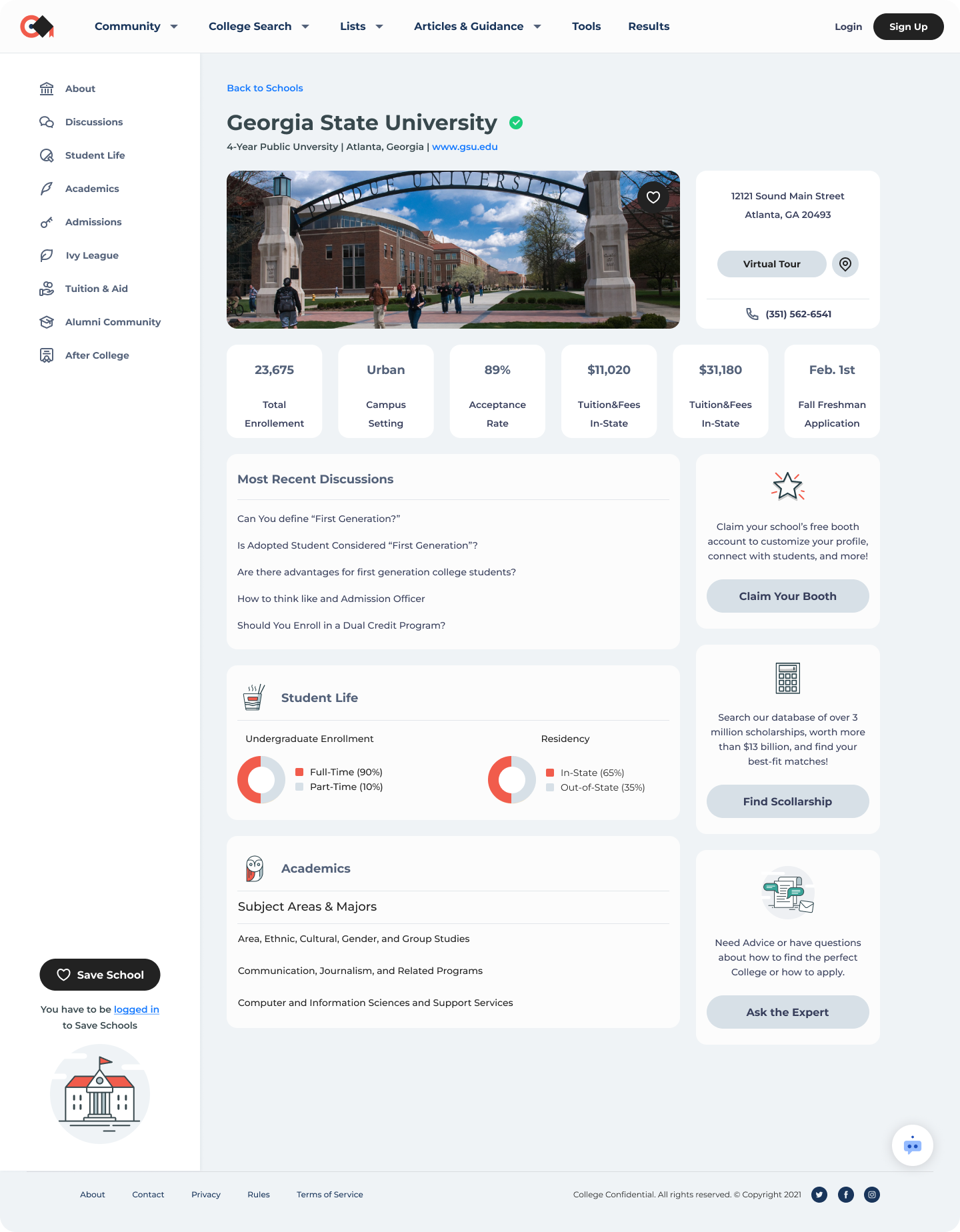
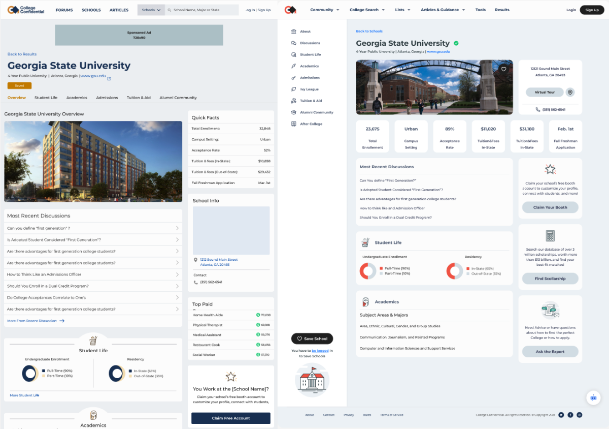
Legacy vs Redesign and Impact
Shown below is a side by side comparison of the old and redesigned version of the Single School page
Some of the key changes include improved information architecture as well as minimalistic design with consistent visuals.
The redesign of the School Detail page significantly improved UX metrics. Low conversion rates and increasing churn rates prompted us to conduct research, leading to the creation of a sticky side sub-navigation for easier access to relevant information across all tabs. This resulted in a 18.75% increase in conversion rates and a 0.125% reduction in churn.